
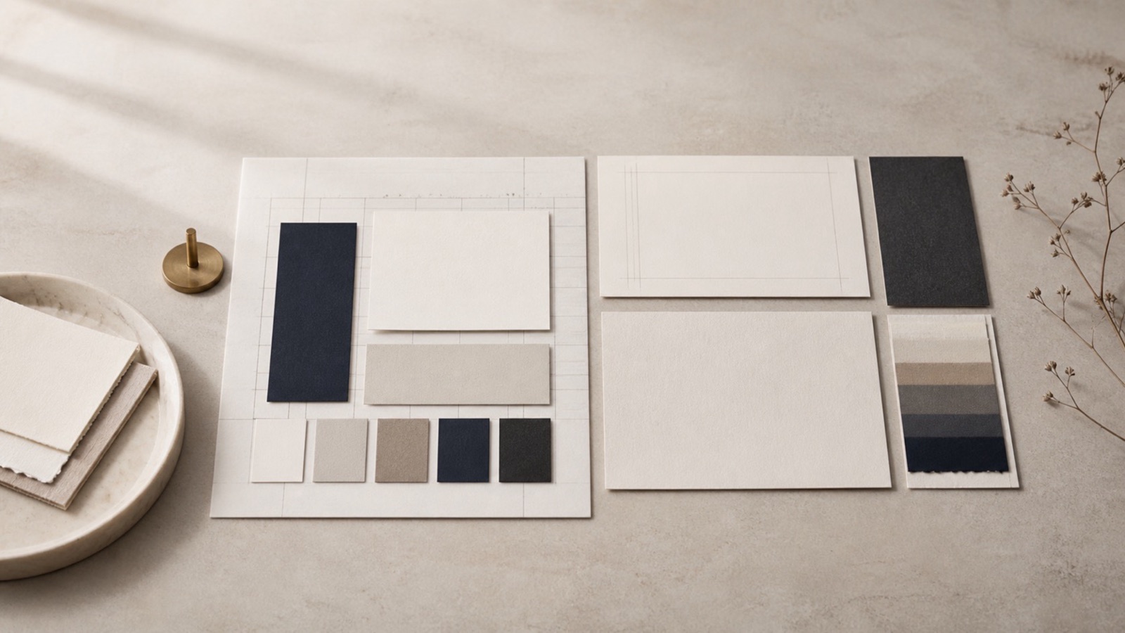
What does your brand say before you speak?
Visual identity shapes an early impression. For a Quiet Power brand, restraint can signal calm and care. In one study of website credibility, people cited visual design more than any other factor (Fogg et al., 2003). Your visual choices are not just decoration. They are part of how visitors judge the page.
What is a visual identity system?
A visual identity system is the set of design parts that represent your brand. It includes your logo, color palette, typography, imagery, icons, and the rules for how they work together. Think of it as a design language. When applied well, this language tells your story without a word. When applied poorly, it creates confusion and distrust.
Color, space, and layout all shape a view of the brand. A clear system also makes the work easier to recognize. The mere-exposure effect shows that repeated exposure to something can increase liking (Zajonc, 1968). A steady visual system may support that sense of familiarity. Familiarity alone does not prove trust.
For a leader or founder, your visual identity is the visual form of your reputation. It must reflect your values and your direction. The goal is not to be loud. It is to be unmistakable.
How do color and typography shape how people see you?
Color and typography carry meaning. Color can help shape brand personality and purchase intent. One study linked red with excitement and blue with competence (Labrecque & Milne, 2012). It also found links with liking and familiarity. Yet context and culture still matter. Test a palette with the people you hope to serve.
Typography works the same way. A clean, readable sans-serif typeface conveys clarity and modernity. A refined serif suggests tradition and elegance. The key is to match the tone to your brand. A bold, thick font may feel strong to some and aggressive to others. A thin, light font may feel delicate or weak. Pick fonts that support the quiet confidence you want. Then use them in a clear hierarchy. Use one font for headings and another for body text. Keep your pairings limited. Two fonts are often enough.
What makes a logo and imagery work well together?
A logo is the anchor of your visual identity. It needs to work in many sizes and places. This means having several versions. A full logo for large screens and print. A simplified version for small spaces like social media avatars. A monochrome or reversed version for dark backgrounds. Each version must still feel like the same brand.
Imagery and illustration style should follow the same logic. If your brand uses photography, the tone, lighting, and composition should stay consistent. A warm, natural light across every image creates a unified feel. If you use illustrations, the line weights, color use, and level of detail should stay the same. Icons should match the same visual language. Do not mix flat icons with detailed illustrations.
Consider a hypothetical consultancy. It uses a clean serif logo on a cream background. Its site pairs earth tones with dark type and photos in natural light. The same colors and fonts appear on LinkedIn and in proposals. This gives the audience a steady visual thread. The example shows coherence, not a promised result.
What about layout, spacing, and accessibility?
Layout and space hold the system together. White space can make text and images easier to scan. It also helps key ideas stand apart. A dense layout may be harder to use. Space is not wasted. It is a tool for focus and ease.
Accessibility is essential. Text needs enough contrast against its background. Use a contrast checker and test type on small screens. Do not rely on color alone to convey meaning. These steps make the system more useful to more people.
Responsive use matters too. Your visual identity needs to work on a phone, tablet, laptop, and large display. Test each part at small and large sizes. A mark that vanishes on mobile is harder to recognize. The system should include rules for each format.
How do you keep the system consistent over time?
A visual identity needs light rules. Put them in a short brand guide. List logo use, color values, type levels, image style, and basic spacing. Add a one-page check for common work. For example, confirm that headers use the approved font. Check that buttons follow the same color and hover rules.
Keep the rules light enough that people will follow them. A small team can use a shared document. A larger team may need a short training session. The goal is not to police every detail. It is to give everyone a clear reference so the brand does not drift over time.
Create templates for work you repeat, such as slides, proposals, and social posts. Keep approved logos, images, icons, and color codes in one shared folder. Name each file by its use and archive old versions. Give one person clear ownership of updates so the current assets stay easy to find.
How do you test if your visual identity works?
A system is only as good as what your audience sees. Test your visual identity with your target audience before you finalize it. Show them your logo versions, your color palette, and a few mockups of your website or materials. Ask simple questions. Does this feel trustworthy? Does it feel innovative or calming? What words come to mind?
You can test recall by showing the mark, hiding it, and asking what stood out. Test clear reading on a small screen. To test perception, ask which words the design brings to mind. A small test is not proof, but it can reveal issues worth checking with a wider group.
There is no single best time to update your system. Review it when your message or your audience changes. If your brand evolves, update the system to match.
Key takeaways
- Visual design can shape a credibility judgment before a visitor reads much of the page.
- Choose a limited color palette and font pairings that reflect the confidence you want to show.
- Create logo versions so the brand works across all sizes and places.
- Use space and accessible contrast to make the system easier to read and use.
- Keep a short brand guide, repeatable templates, a clear asset folder, and one owner for updates.
- Test your visual identity for recognition, legibility, and intended perception with a small audience before launching.
Frequently asked questions
References
- Fogg, B. J., Soohoo, C., Danielson, D. R., Marable, L., Stanford, J., & Tauber, E. R. (2003). How do users evaluate the credibility of Web sites? A study with over 2,500 participants. Proceedings of the 2003 Conference on Designing for User Experiences (DUX '03), 1-15.
- Labrecque, L. I., & Milne, G. R. (2012). Exciting red and competent blue: The importance of color in marketing. Journal of the Academy of Marketing Science, 40(5), 711-727.
- Zajonc, R. B. (1968). Attitudinal effects of mere exposure. Journal of Personality and Social Psychology, 9(2, Pt.2), 1-27.
This article reflects the personal experience and views of Mherie Vic Palomo-Prevendido and is for general information and education only - not financial, legal, tax, medical, or psychological advice. Your results will vary.